The Structural Group
Redesigning the Structural Group's Website

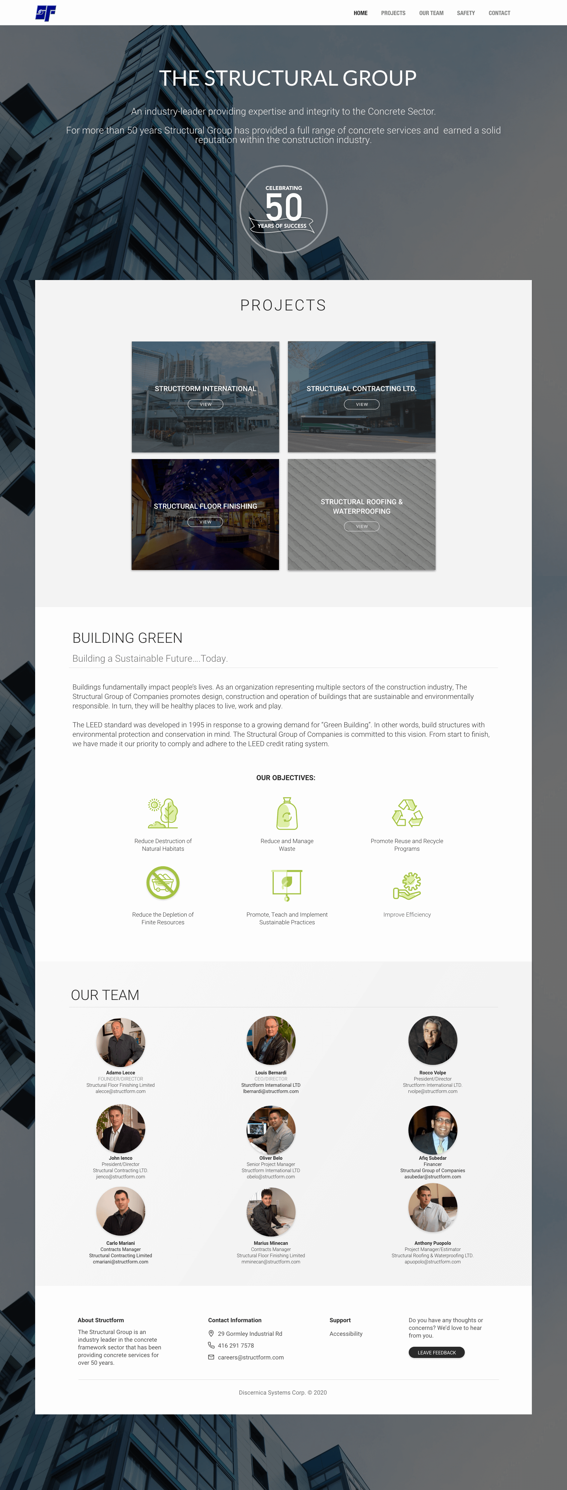
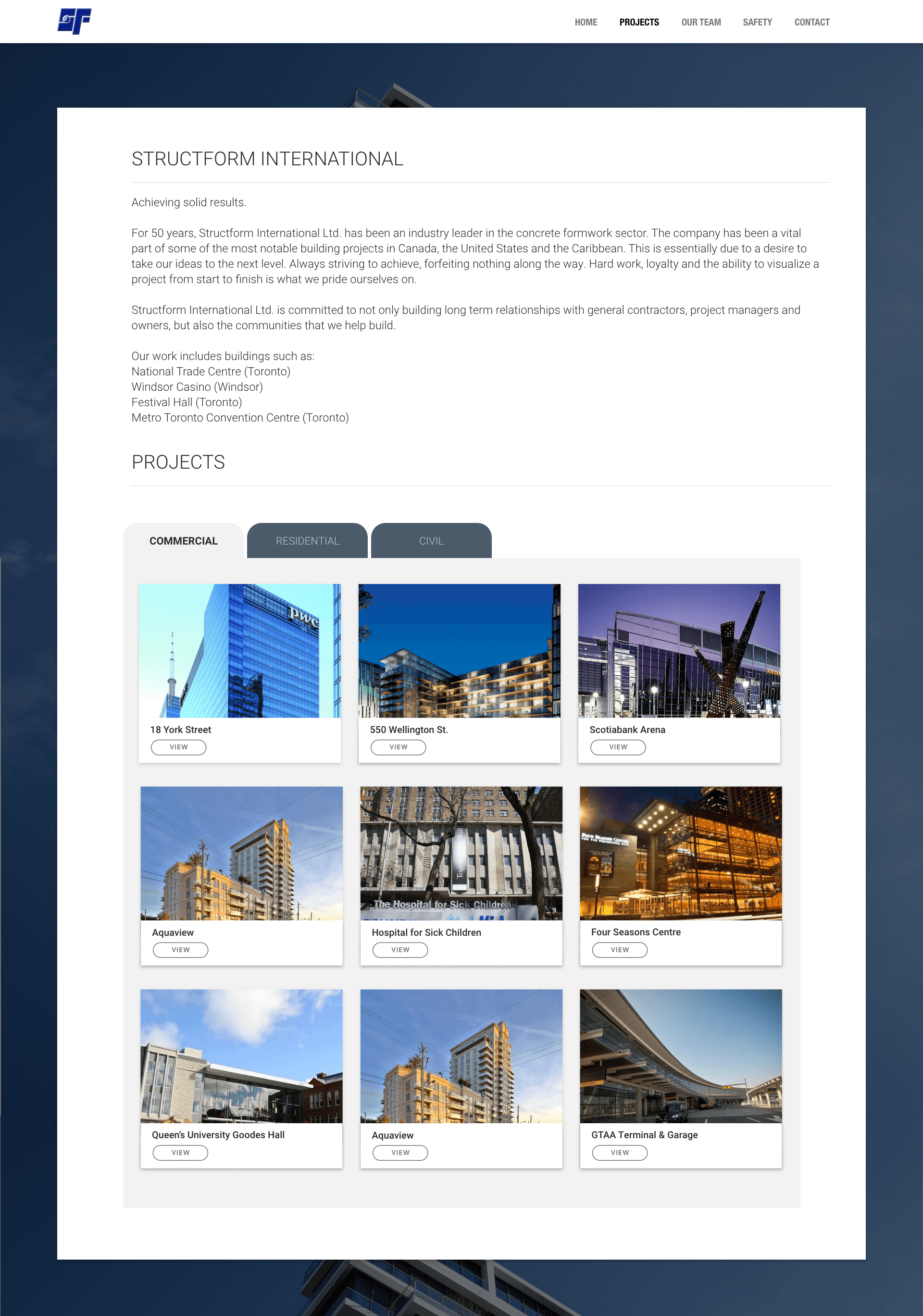
The Structural Group of Companies encompasses four construction divisions that have been providing a full range of concrete services for over 50 years. Over the decades, the Structural Group has earned a solid reputation within the construction industry and has been involved in some of the most notable building projects in Canada, the United States and the Caribbean.
The Structural Group was not satisfied with their existing website since it didn’t reflect the quality, look and reputation of their company. They needed a complete redesign to ensure their website was user friendly and met the standards of their company.
To determine the specific issues with the existing website, I conducted moderated usability tests where I recruited 5 users to navigate through the original website. I gave them a series of tasks to accomplish and asked them questions about the sites organization, navigation and visual design. My main goal was to determine the major pain points and issues that users faced so that I could design better solutions for the new website.
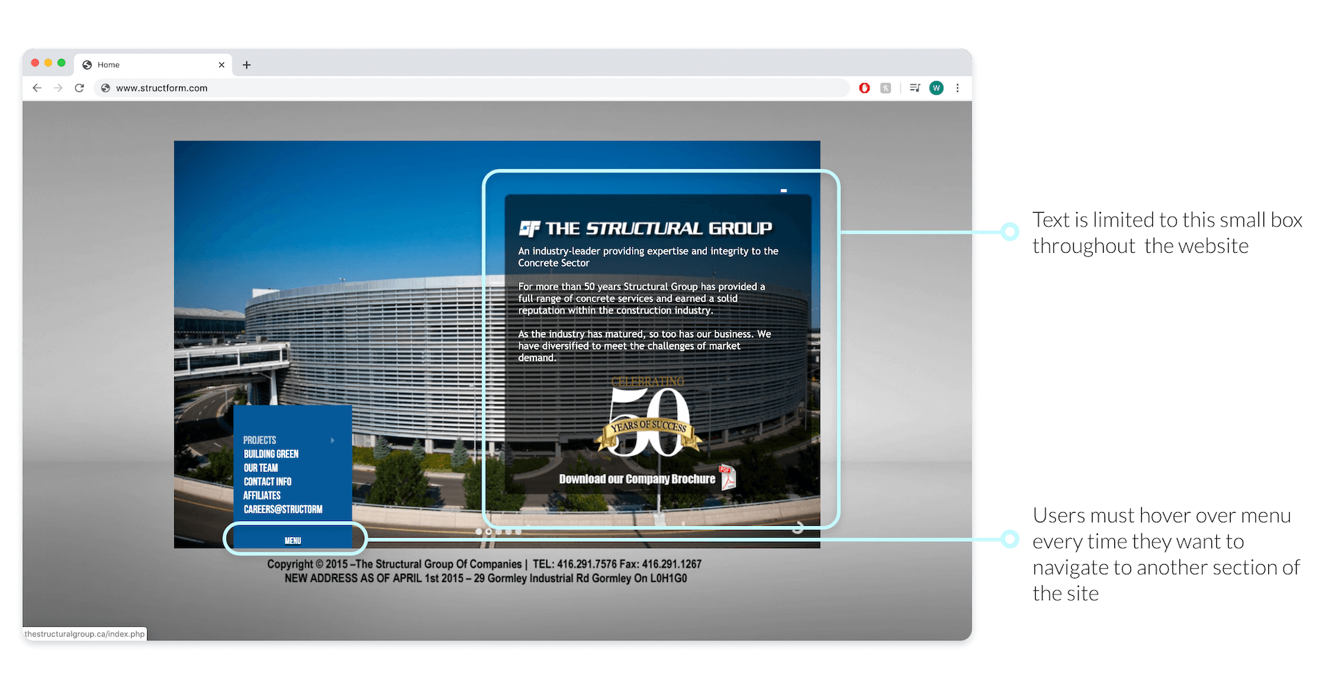
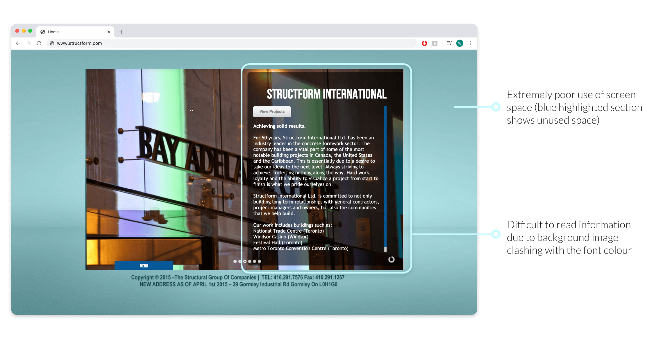
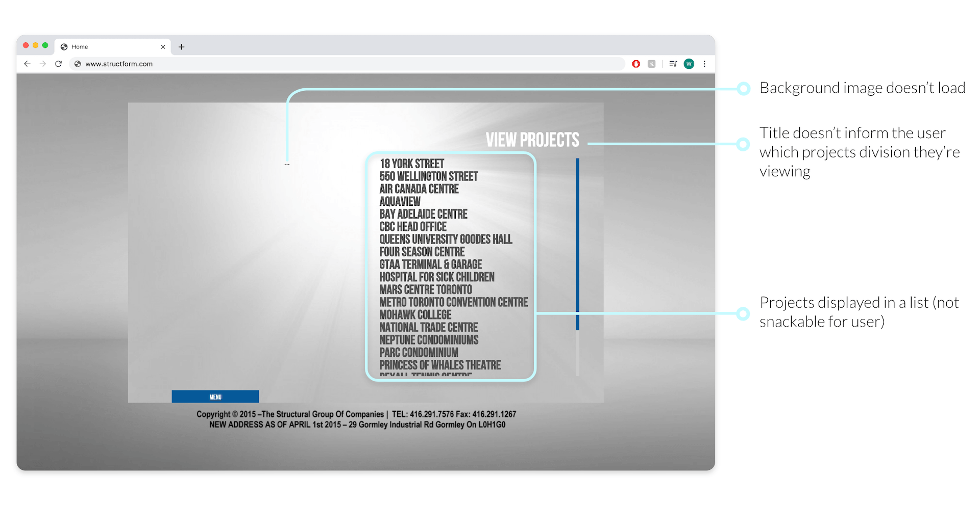
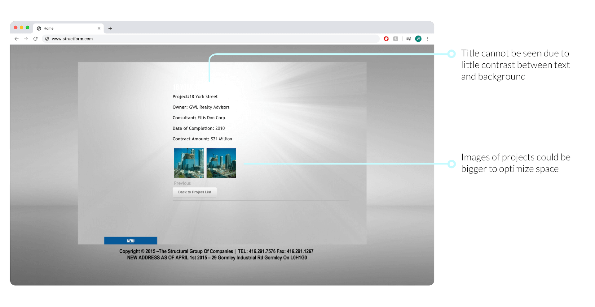
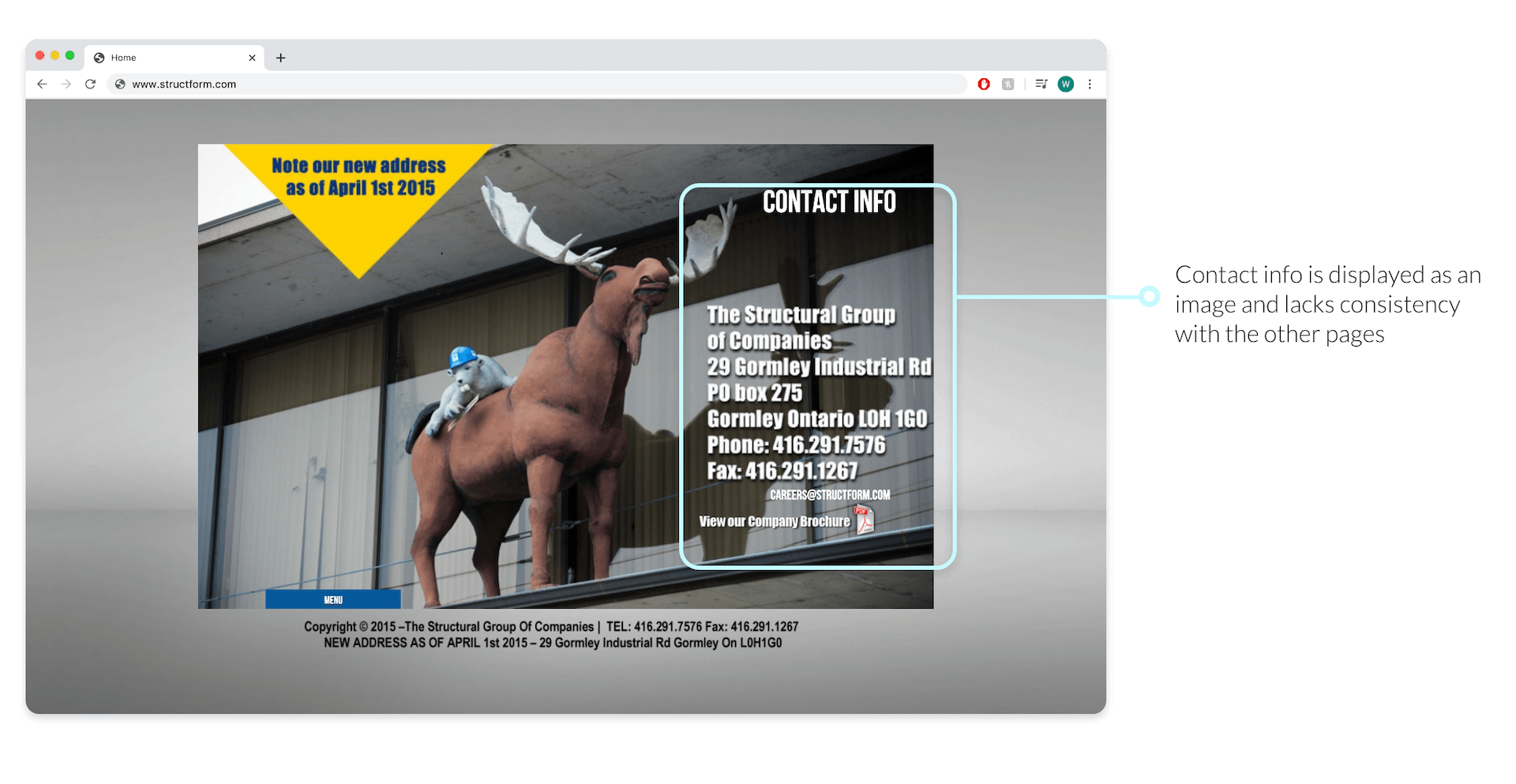
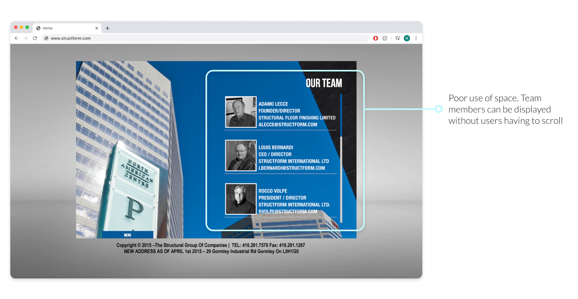
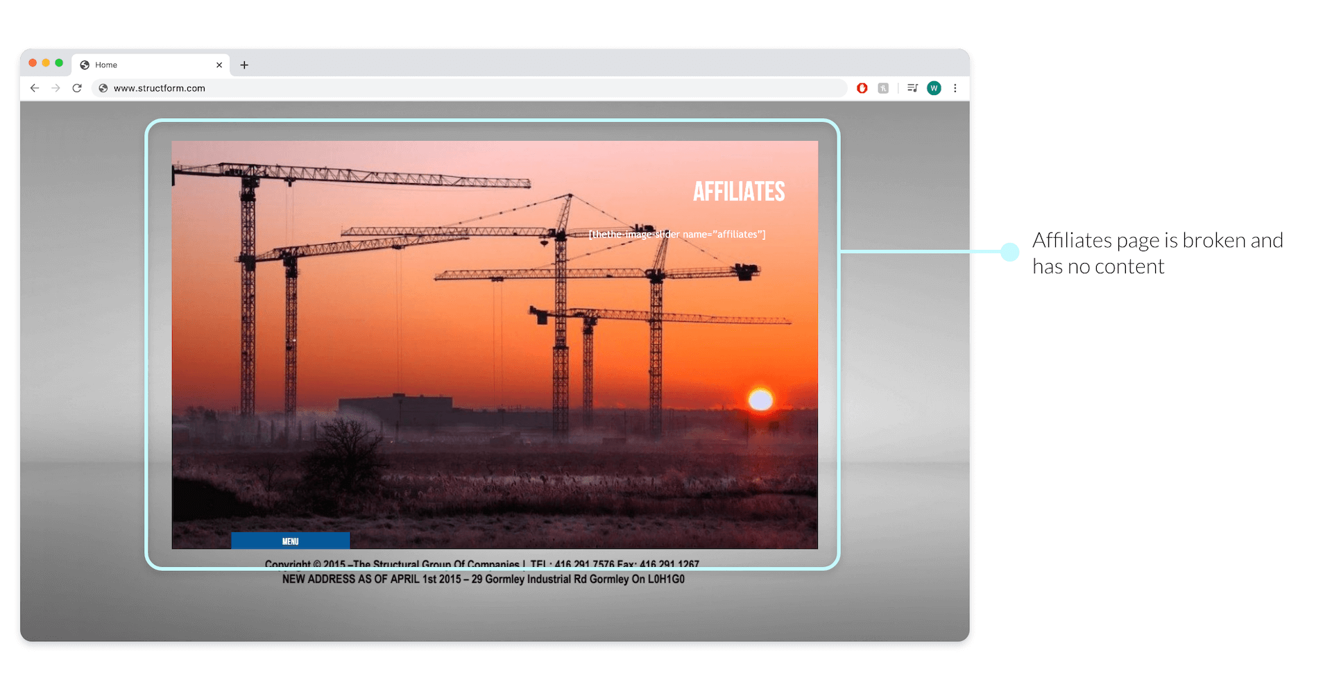
Below are the issues users commented on during their usability test:
Overall the major issues of the website were:
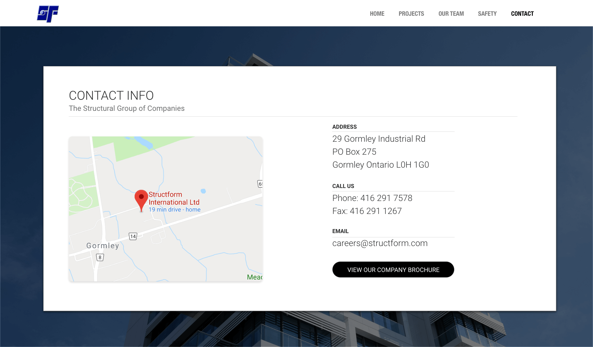
An organized website allows users to easily navigate and find the information they need quickly. The existing website had poor navigation and lacked organization making it difficult for users to move through the site.
Visually appealing and functional websites enhance the user experience and give users a sense of the company's quality. The design of the old website was inconsistent and jeopardized its trust with users.
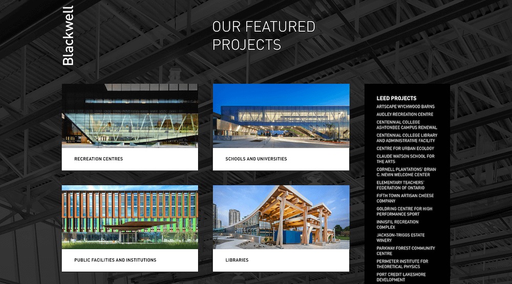
Before beginning the visual design process, I visited the websites of similar companies to gain inspiration and get the feel of these types of businesses. I explored the websites of Ellis Don, Blackwell, Eastern Construction, Minto and PCL.
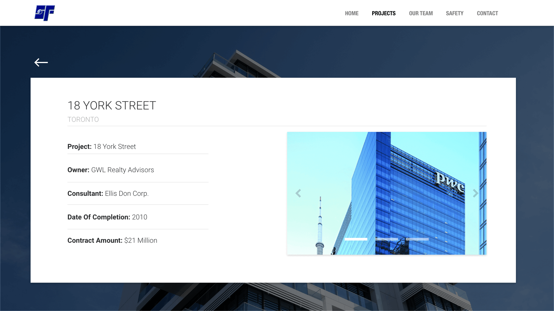
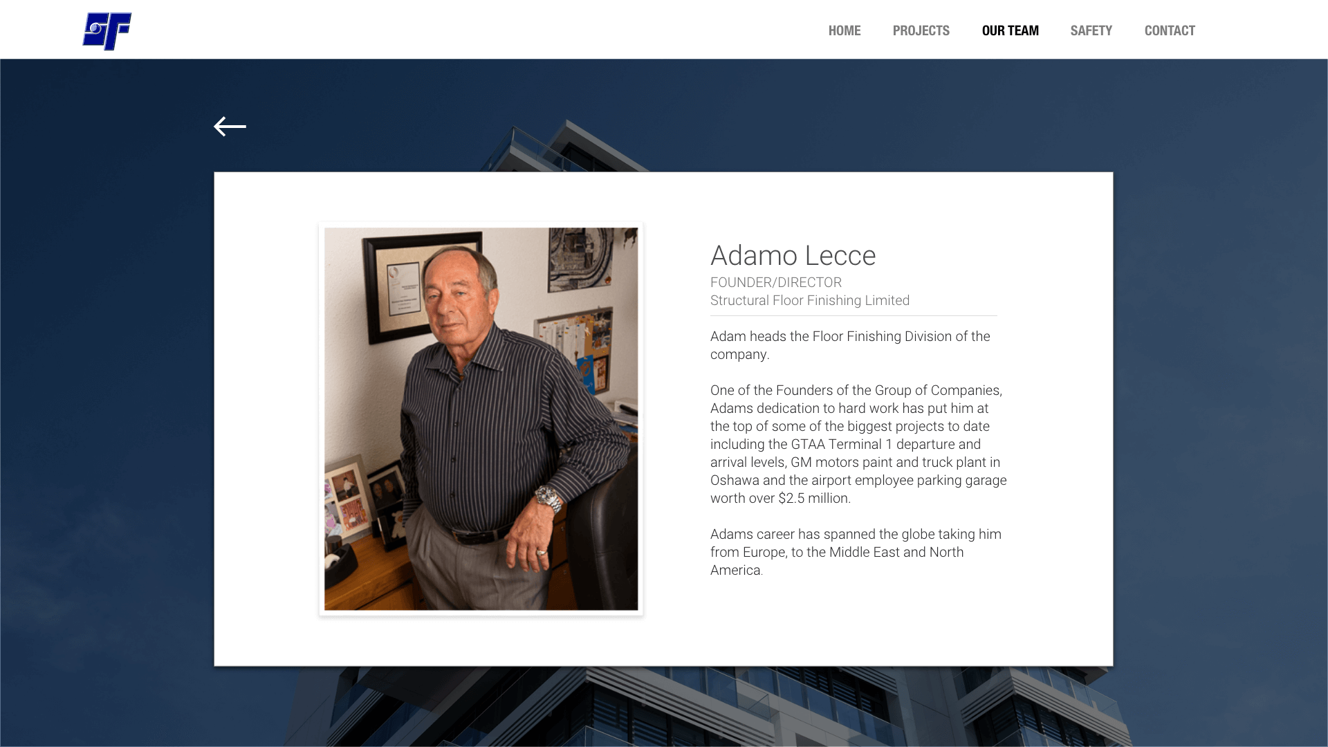
Comparing the Structural Group’s original website to its competitors made it clear that a lot of visual improvements needed to be made. A notable difference was the use of space; the client’s website did not optimize screen space and looked overall tacky and unprofessional compared to its competitors. I also kept in mind the way the competitors displayed their projects; instead of simply listing the project names, they included a photo and title.
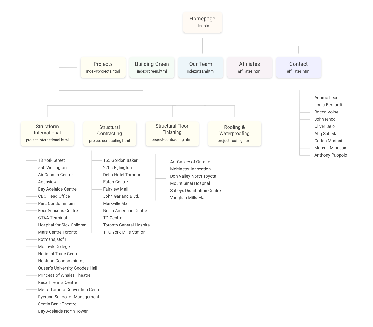
I created a sitemap for the new website in order to determine how to structure the navigation and understand the website's hierarchy before building it.
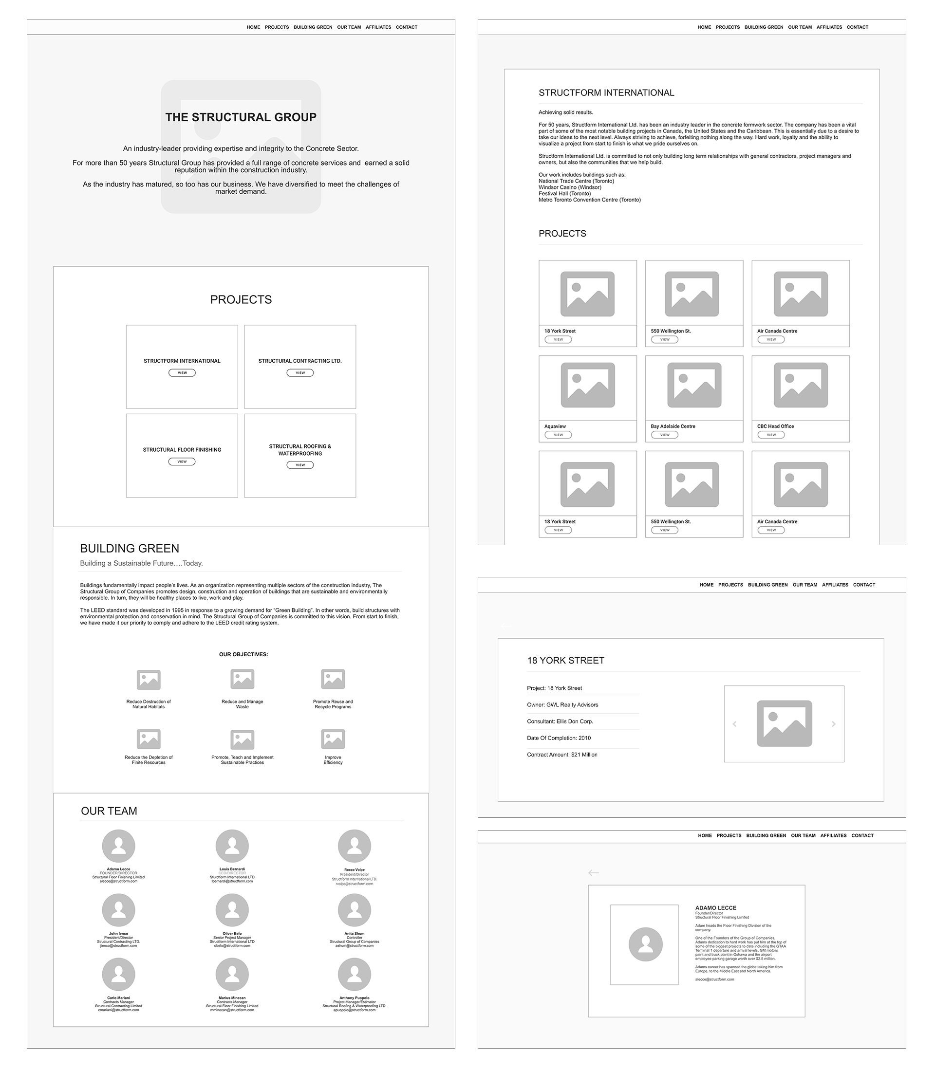
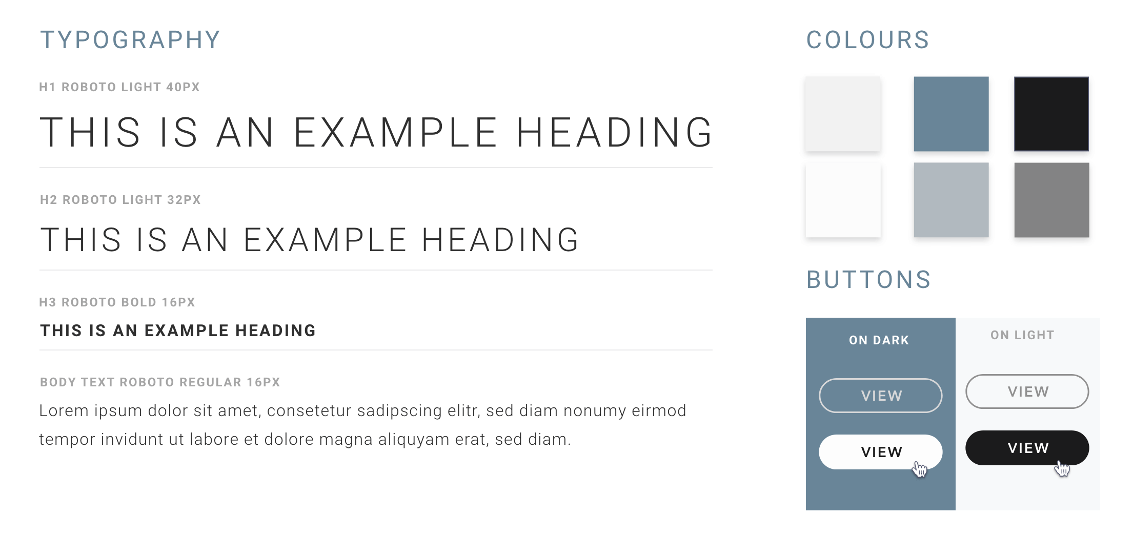
Once the low-fidelity wireframes were finalized, I created the following style guide to use during the high-fidelity design phase.
I thought it would be engaging to include icons for the “Building Green” objectives section as they would help communicate the message of the Structural Group’s environmental efforts. I used Adobe Illustrator to customize the following icons:
Once the high-fidelity wireframes were completed and approved by the client, I began developing the website. I used HTML5, CSS3, Bootstrap4 and Subversion to develop the site and ensure it was responsive across all device screens. I implemented animations, micro-interactions and added scroll behaviour to the website to make it more interactive. I'm currently developing more pages and communicating with the client to gather further details and ensure the website is meeting all requirements.